Transforming Operational Complexity into Scalable Workflows
Redesigning a fragmented enterprise platform used for high-stakes fleet intelligence and operational decision-making across global logistics workflows.

Ecosystem

Fleet operators
Monitor fleet activity and track performance.

Drivers
Operate vehicles and follow safe driving practices.

Service team
Handle servicing, repairs, and preventive maintenance.

Finance team
Manage fleet budgeting, expenses, and payments.

Compliance team
Manage documents, permits, and regulatory compliance.
The platform is a predictive fleet intelligence product. Onboard sensors stream vehicle data into digital twin models that flag faults before they become breakdowns, and fleet operators, service teams, finance and compliance all run their daily work through it.
Monitor fleet activity
Investigate anomalies
Trip planning
Reports - Analyze operational patterns
Role & responsibilities
Industry
Fleet logistics
Company
NDA
Duration
12 Months
My role
Lead UI/UX Designer
Worked with 2 product designers, a UX researcher, 2 PMs, and the platform engineering team. I owned strategy, research setup, the design system.
Impact
Efficiency improved by
38%
Rollout strategy
Phased
Total vehicles
+300,000
Release
Global
Problem Statement
Repackage the existing product for global scale by redesigning its UI into a cohesive, scalable, and consistent experience.
Started as a UI revamp
After ten years in the market, the company was expanding globally and hearing consistent feedback from Western prospects: the product didn't feel built for them. Stakeholders read that as a visual problem and scoped a UI refresh. That was the brief I was given.

Custom tailored features
Inconsistent UI/UX
Global considerations
Ready for western users
UX Audit
I audited the platform against Nielsen's usability heuristics. Three findings turned out to be structural rather than cosmetic, and those three drove the redesign strategy.

01.
Match between system and real world
Top navigation was ordered by feature, not by workflow. Investigating a single anomaly meant crossing three unrelated modules and refiltering at each one.
02.
Recognition rather than recall
Related data lived in disconnected views with no way to tag, pin, or carry context between them. Operators were writing vehicle numbers on paper to hold state across screens.
03.
Consistency and standards
Icons, type, colour, spacing, and grid diverged across modules built for individual clients. Several combinations failed contrast requirements.
The full audit covered all ten heuristics. The remaining seven surfaced issues that were real but locally fixable: system status visibility, undo, touch target sizing, error explanations hidden in the UI, keyboard shortcuts and bulk actions, visual density, and missing onboarding documentation. These were folded into Phase 01 as high-friction flow fixes.

Resulting
Repeated filtering actions
Broken investigative journeys
Disconnected data relationships
Manually memorize data
No option to custom data export
Inconsistent UI/UX designs
This significantly increased cognitive load and slowed critical workflows
Discovery & organizational alignment
The project came to me scoped as a UI refresh. After auditing the platform I pushed back on that framing: the real problem was structural, not visual. Years of client-specific feature requests had produced a fragmented experience where a single page carried far more information and functionality than any workflow needed.
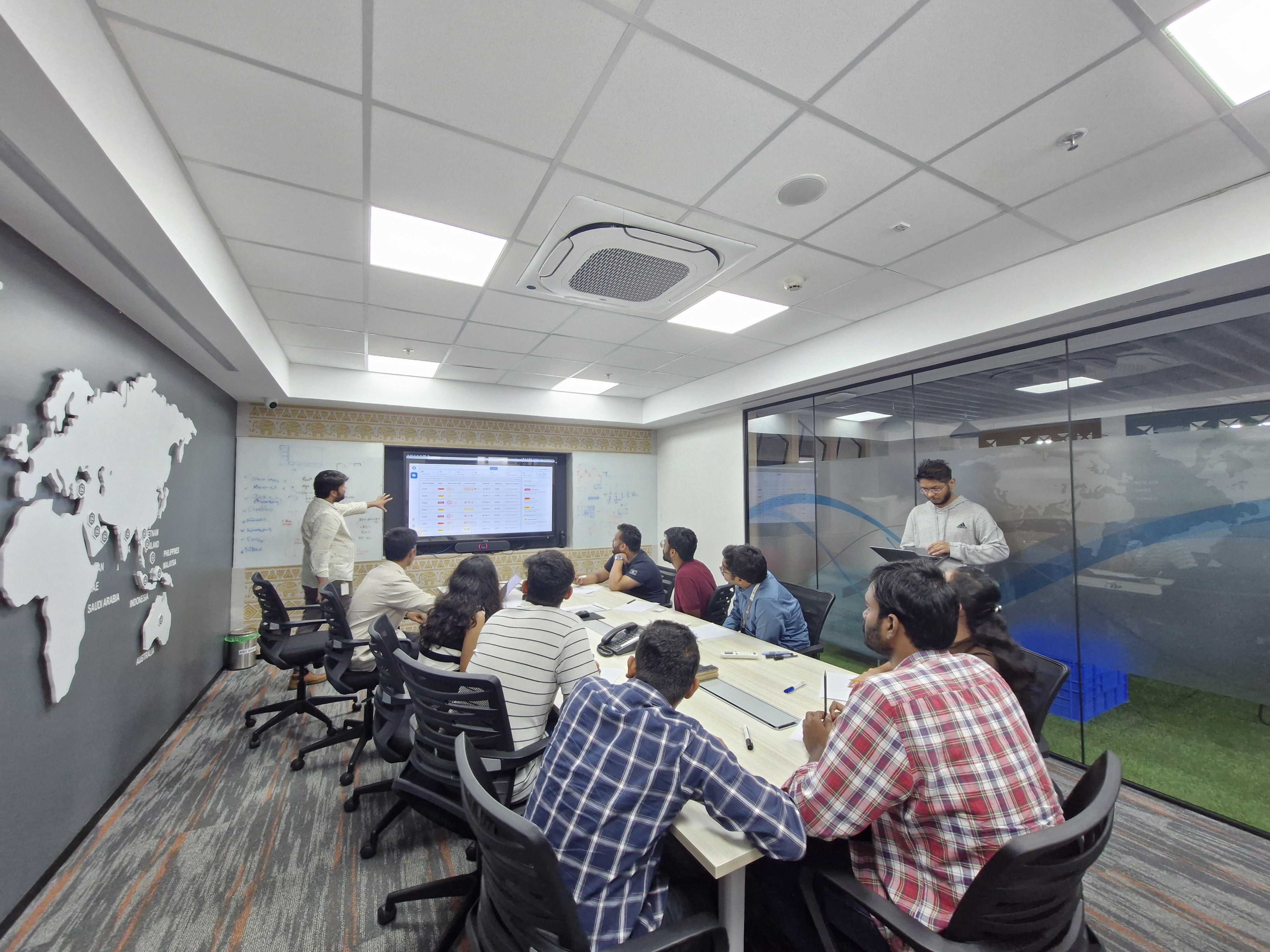
Internal operational mapping
Strategic Input
I brought Product, Engineering, Support, and Operations into a shared working session to pressure-test the audit findings before any solutions were on the table. Support turned out to hold the clearest picture of where users got stuck, which is why I made their ticket data a standing input to prioritisation rather than a one-time review.
Customer feedback systems
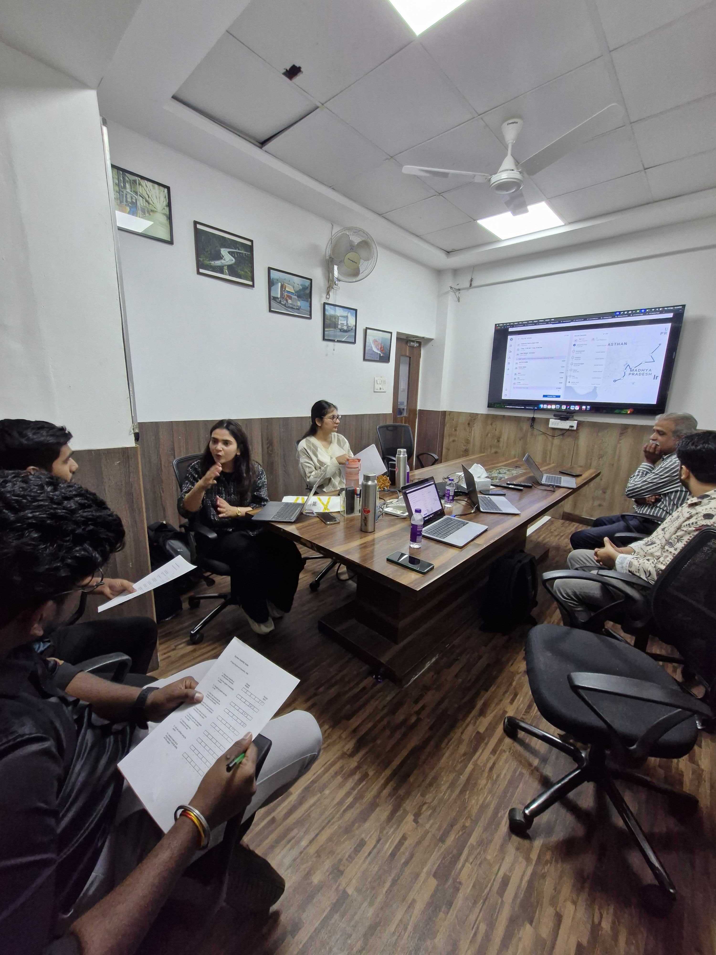
With internal alignment in place, we took the hypotheses to customers. We framed the sessions around four questions:
1. Why they used the product?
2. Where they saw its value?
3. Which workflows they could not afford to lose, and where it was failing them?
Workflow analysis
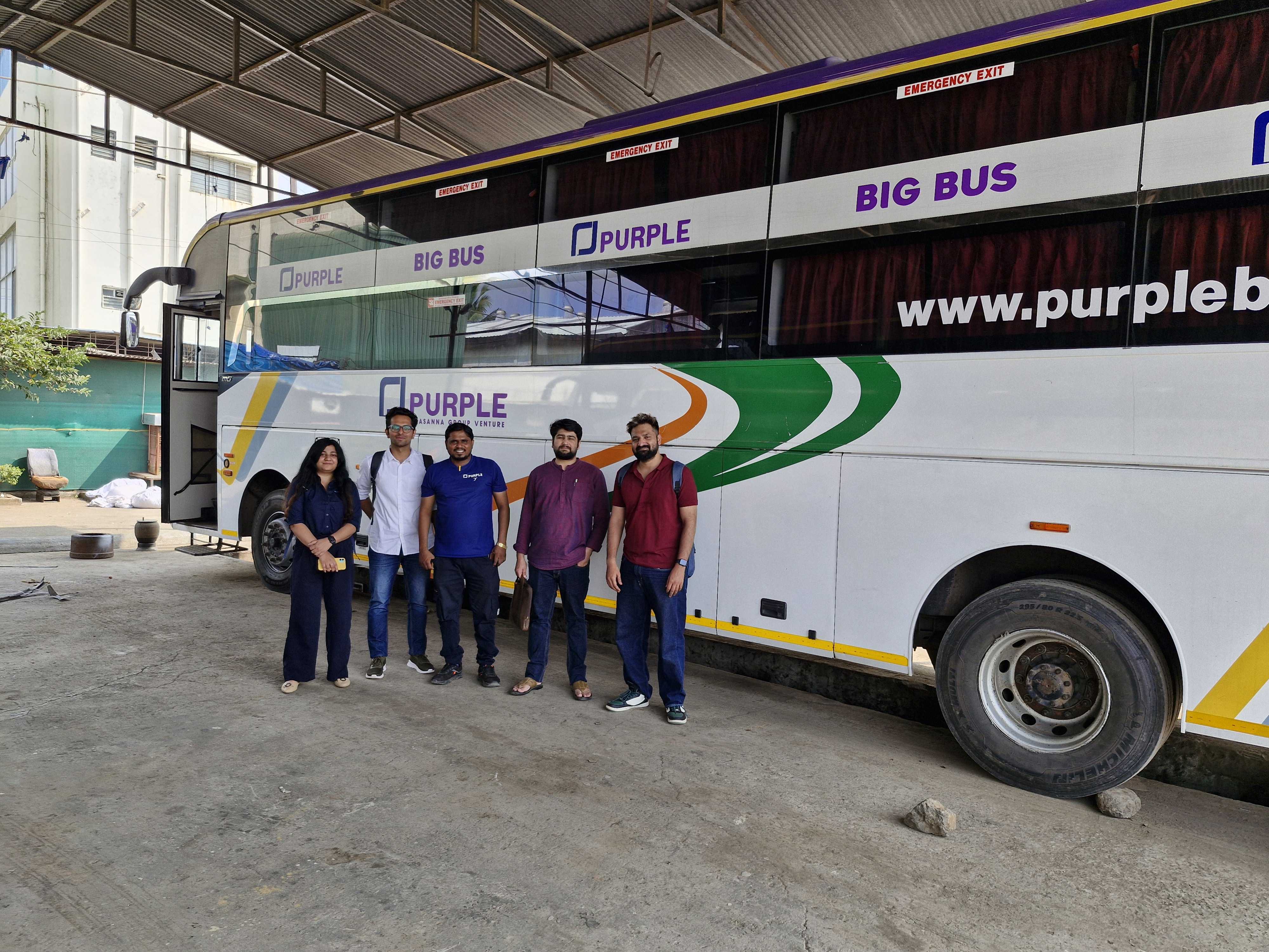
We deliberately ran sessions across both India and North America rather than treating one market as the default. That choice surfaced the distinction that shaped the rest of the redesign: which needs were region-specific and which were universal, so we could build scalable patterns instead of parallel solutions.


North America


India
One of the biggest discoveries was that users frequently left the platform to complete operational workflows elsewhere
Feature prioritization
Strategic Input
Because the platform was operationally critical, assumptions could not drive redesign decisions.
I introduced a weighted FMEA and RICE model, set the criteria and weights with Product and Engineering, and used it to sequence the roadmap. It moved the argument from whose opinion carried most weight to what the scoring showed.

Defining the transformation strategy
A big-bang redesign carried real operational risk: customers ran daily logistics on this platform and could not absorb a broken week. I recommended a phased transformation instead, stabilise the experience first, re-architect second, and made the case to leadership for the slower path. The trade-off was that visible modernisation took longer than stakeholders wanted.
Phase 01: Stabilize the experience
Goal: Reduce immediate usability pain without disrupting existing workflows.
Dead-end removal
Accessibility guidelines
Improve high-friction flows
Introduced design system

Reading distance
Service floor teams read the platform off wall-mounted TVs from up to 10 feet away. The type scale holds at that distance, with a dark variant for floor displays.
Naming structure
Layered tokens
Pattern library

Full Design System
Phase 02: Re-Architect the ecosystem
Goal: Transition the product from fragmented modules into a scalable operational ecosystem. Enabling CRUD & user management
Global Inclusivity
Modular designs for scale
More control to users
Rejected Designs
Before vs After
Outcome
Improved efficiency
Anomaly investigation: 38% faster: Measured as median time from alert to resolution, tracked in product analytics across the 12 pilot accounts over 2 weeks. The alert case measured was a mileage drop.
Design system
We built a scalable design system with 543 components, 150+ icons, and standardized SI units to ensure consistency across the product ecosystem.
We improved scalability
Enabled reusable, modular workflows to support evolving client needs without compromising consistency.
Retrospective
Enterprise UX Is often constrained by data architecture and several usability issues originated from fragmented backend structures rather than interface design alone.
Users valued uninterrupted investigative workflows more than isolated interface optimizations.
Organizational alignment must start early which would have accelerated discovery, prioritization, and rollout planning.
Scalable systems require product thinking, Not just UI consistency.
Long-term scalability depended on operational architecture, modular foundations, and ecosystem-level thinking.
Other Projects

Health Monitoring HMI
Designed an in-cabin HMI system that delivers real-time vehicle health insights and actionable maintenance recommendations, helping drivers make informed decisions and reduce unexpected downtime.
Password Protected


Video Telematics System
Designed an intelligent video telematics experience that leverages in-cabin and on-road smart dashcams to identify unsafe driving events, deliver timely interventions, and help fleets build safer driving habits.
Password Protected
The life of a designer is a life of fight:
fight against the ugliness.
— Massimo Vignelli