The life of a designer is a life of fight:
fight against the ugliness.
— Massimo Vignelli
A Design System That Speaks to Design, Code, and Analytics
Building a Figma design system where every name, token, component, and layer was designed to survive contact with three different audiences: designers, engineers, and whoever reads the product analytics.

DESIGN SYSTEM
My role
Design System Lead (solo build)
Scope
Tokens → Component library → Cross-tool naming taxonomy
Tools
Figma
The Problem
Most design system case studies are graded on one axis: does it look consistent. Buttons match, spacing is even, the color palette is on-brand. That's necessary, but it's not the part that actually breaks at scale. What breaks a design system on a real team isn't the pixels it's the names.
An engineer opens Dev Mode and finds a corner radius bound to something called Radius-16.
A PM opens Mixpanel and finds forty near-identical events because every button variant got its own event name.
A new designer opens the file and can't tell if Frame 39 is load-bearing or leftover. None of that is a visual defect.
It's a naming defect, and it compounds faster than any visual inconsistency does, because nobody notices until the file has hundreds of components and the fix means touching all of them. I wanted to build a system that was graded on that axis specifically: would the name of every token and component still make sense to a stranger, in three different tools, a year from now.


Foundations Before Components
Before a single button existed, the system was built bottom-up: Primitive tokens → Semantic tokens → Components,
in that strict order. This wasn't a style preference it was a bet on maintenance cost. If a component references a raw color value directly, a rebrand means editing every component. If it references a semantic token that aliases a primitive, a rebrand is one edit that cascades everywhere.
The rule that shaped every naming decision from here on: semantic tokens describe a role, never an appearance. text-danger, not text-red. The day the danger color needed to shift for accessibility reasons, text-danger kept being true. text-red would have started lying the moment the hex changed.


Building Components With Tokens
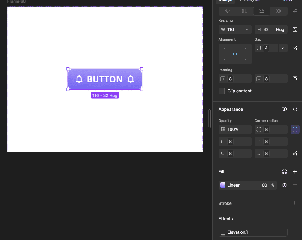
Foundations only pay off once components actually consume them a token that exists but isn't bound to anything is just a color swatch with extra steps. Every property on the first component built in this system (a Button) was deliberately bound to a Foundation token rather than typed as a raw value: padding and the icon-to-label gap bound to Space tokens, corner radius bound to a Radius token, background and label color bound to Semantic color tokens.
The test applied to every single property before moving to the next: is this a bound variable, or a typed number sitting next to the system instead of using it. That distinction is the actual difference between a component that's part of the system and one that just happens to look consistent with it today.
Restricting Token Visibility With Scopes
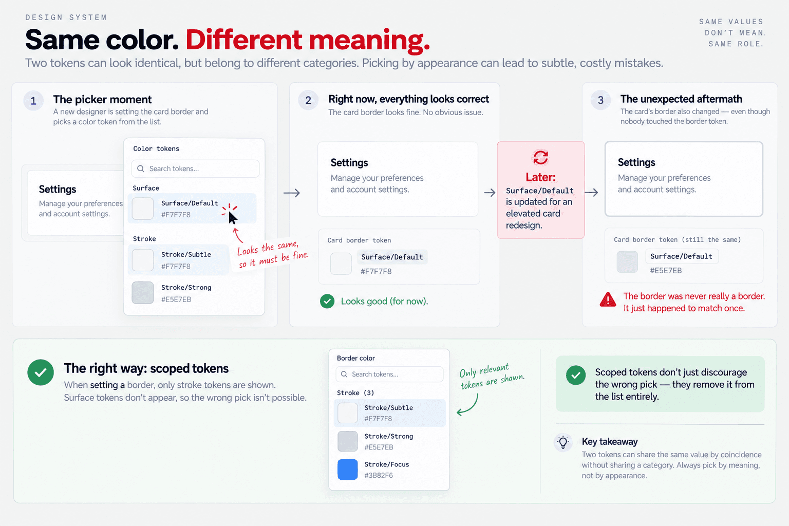
Foundations alone don't stop someone from binding a token to the wrong property nothing prevents a stroke-only color from being picked for a background fill, other than the person reading the name carefully. Figma's variable Scopes setting closes that gap: each variable is restricted to only the property types it's meant for (Stroke, Fill, Corner Radius, Gap, etc.), so a stroke token simply doesn't appear as an option when someone opens a fill picker. This is the same governing idea behind every naming decision in this system constrain what's offered, not just what's named well applied at the tooling level instead of the naming level.

Nested Component Properties
Button's Icon slot is a real nested instance, not an empty placeholder which meant changing which icon a Button displays would normally require drilling into that nested layer directly: workable solo, a real friction point for a team placing dozens of Button instances across a product. Figma allows a nested instance's own properties to be exposed up to the parent component's top-level property panel, so "Icon" appears directly on Button itself, no drill-down required.


Slots the pattern that makes components editable without opening them
A slot is what a boolean-plus-instance-swap property pair actually produces: a content area a consuming designer can fill, empty, or swap without ever opening the base component.

Building the Naming Framework
The harder problem is component naming specifically, how to classify and name UI pieces so the same name could mean something in Figma, in code, and in an analytics event, without a translation document that someone has to maintain by hand.
I used Atomic Design as the classification system, but the interesting part wasn't adopting the framework it was working out a precise, defensible test for where the lines actually sit, because "it's made of smaller parts" turns out to be true of almost everything and doesn't actually tell you which tier something belongs in.
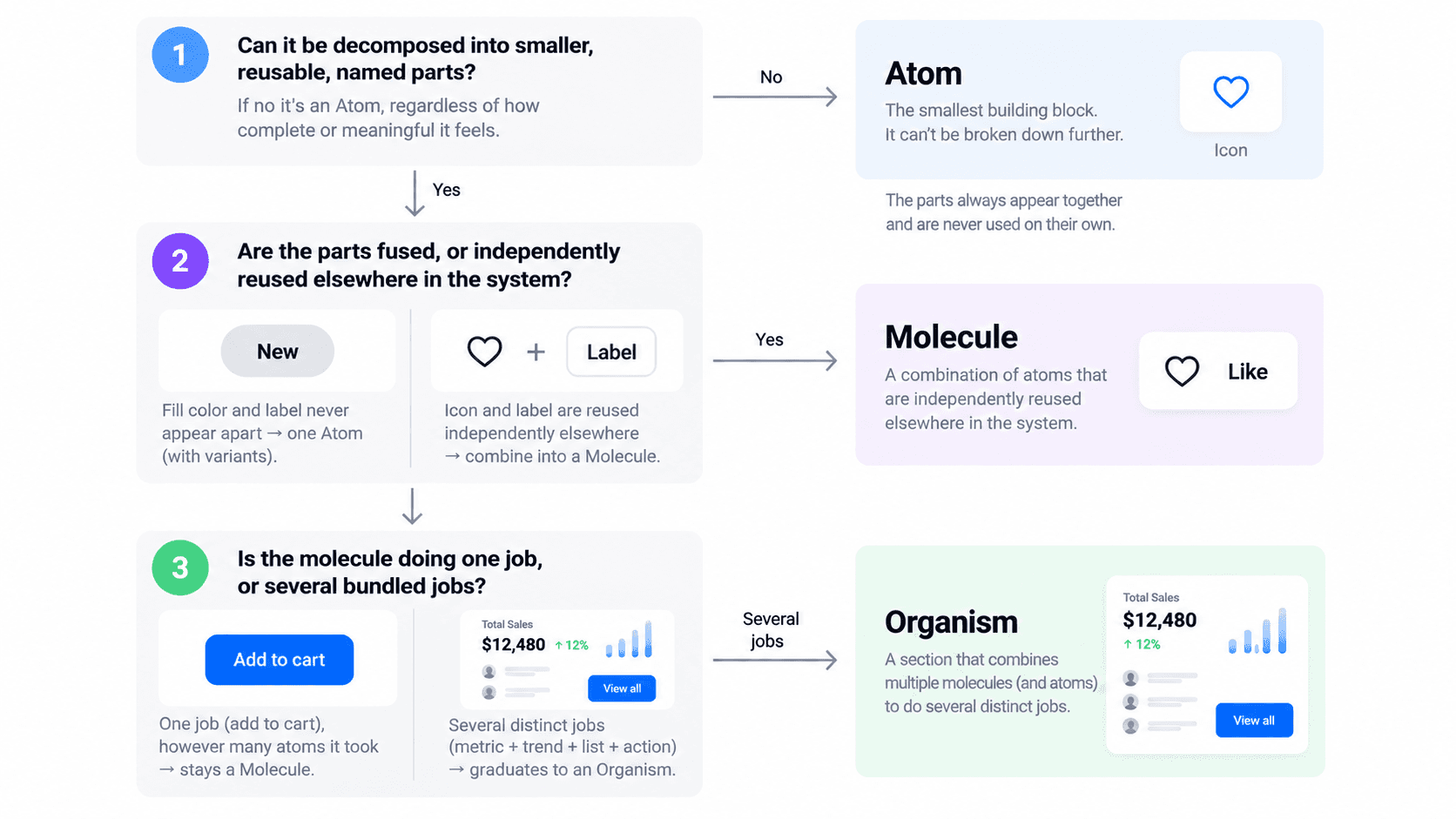
The test that survived scrutiny, in order:
Can it be decomposed into smaller, reusable, named parts? If no it's an Atom, regardless of how complete or meaningful it feels standing alone. (A single icon feels "complete," but that's irrelevant it can't be broken down further, so it's an atom.)
If yes, are the parts fused, or independently reused elsewhere in the system? Two pieces that never appear apart anywhere in the file (a chip's fill color and its label) collapse into one Atom with a variant property. Two pieces that each have an independent life elsewhere (an icon that also appears standalone; a state-container pattern reused for tabs) combine into a Molecule.
Is the molecule doing one job, or several bundled jobs? One job, however many atoms it took: stays a Molecule. Several distinct jobs bundled into one section (a metric and a trend line and a list and an action): graduates to Organism.
The Cross-Tool Bridge: One Name, Three Systems
The naming payoff of doing the atomic classification rigorously is that the same hierarchy becomes the backbone of the analytics taxonomy, for free. A component's Figma name, its code name, and its Analytical tool name identity are never independently decided one is authored, the other two are derived.

The rule underneath this table, stated as plainly as possible: if two things differ only by a swappable property, they are never two names. Not in Figma (one Component Set with a Variant property, not Chip/Positive and Chip/Negative as separate components), not in analytics (one event carrying a variant property, not chip_positive_clicked and chip_negative_clicked as separate events). Location works the same way — a component doesn't encode which page or card it's on in its own name; a parent Organism stamps that context onto every event fired from inside it, so page and section properties are populated automatically rather than hand-maintained per instance.

What This Enables
Dev handoff needs no mapping document. A developer opening Dev Mode sees a component name that's already the code name no translation layer to keep in sync, and nothing to go stale.
The analytics tracking plan scales without exploding. New variants (a third Chip sentiment, a new Card type) need a new property value, not a new event definition and re-instrumented code.
Governance has a documented decision rule, not tribal knowledge. The composition-gate / single-outcome-ceiling test means the next person extending this system has a repeatable question to ask, not a "does this feel right" judgment call.
Other Projects

Fleet Monitoring System
We designed a platform that consolidated competitor tracking, market share trends, and sales performance into one workspace, giving teams a clear read on where they were winning, where they were losing ground, and why.
Password Protected



Video Telematics System
Designed an intelligent video telematics experience that leverages in-cabin and on-road smart dashcams to identify unsafe driving events, deliver timely interventions, and help fleets build safer driving habits.
Password Protected
