The life of a designer is a life of fight:
fight against the ugliness.
— Massimo Vignelli
Designing trust for India’s tractor economy
Transforming an IoT-enabled tractor tracking product into a trusted business platform for fleet owners across rural India.

Understanding the rural tractor economy
In rural India, tractors are not just vehicles. They are income-generating businesses.
Fleet owners rent tractors to farmers for agricultural operations such as ploughing, sowing, and harvesting. Payments are often tracked manually, collections happen across villages, and operational visibility is extremely limited.

Role & responsibilities
My role
Lead UI/UX Designer
Worked with 1 product designer, 1 PM, and the engineering team. I owned research, design system, and final design decisions.
Impact
User growth
6x
Revenue increase
5x
Retention improvement
17%
Avg. satisfaction
9.4/10
Problem Statement
Unorganized tractor ecosystem makes it difficult for fleet owners to efficiently manage their tractors, drivers, and day-to-day operations.
How operations ran

Resulting
Fuel theft
Payment disputes were common
Owners had no visibility of their business
Collections were delayed
Research & field discovery
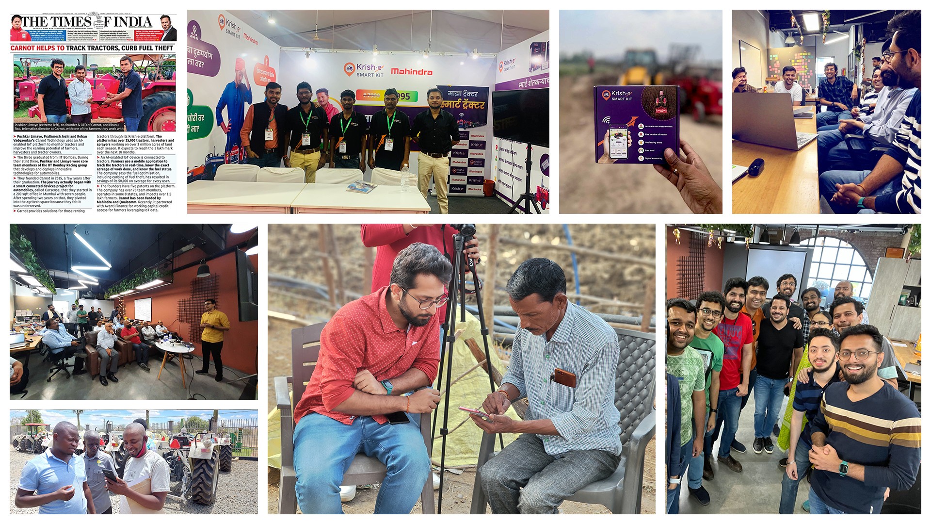
To understand what owners actually needed beyond location tracking, we went into the field talking to farmers, fleet owners, and the teams who worked with them every day.
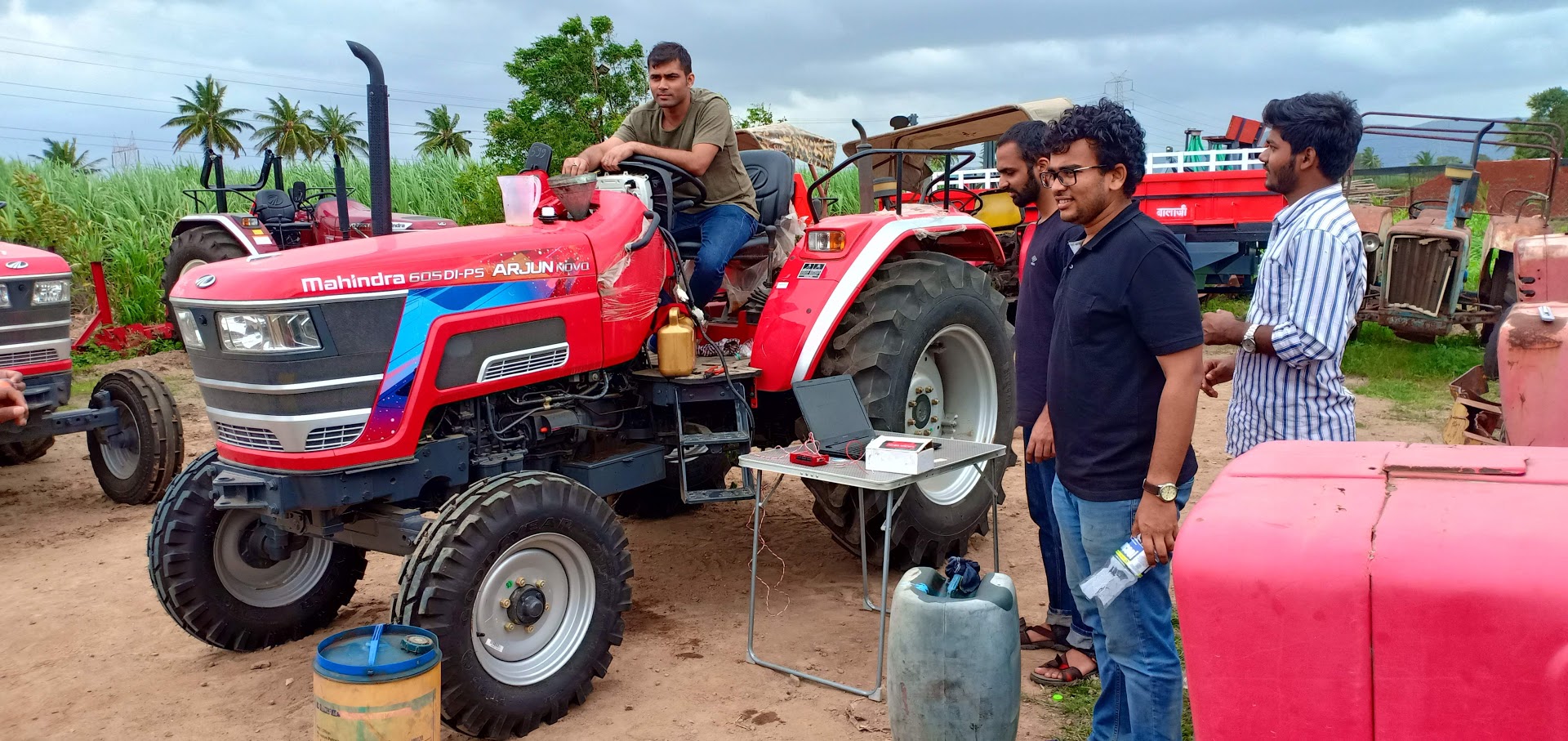


We wanted to understand
How rural operators make decisions?
How trust is built?
How accounting works in reality?
How users perceive technology?
Looking inward
Heuristic evaluation of the app
Internal audit with sales and support team
Research
Conducted qualitative interviews with fleet owners to understand their pain points, workflows, and operational challenges.
150+ Fleet owner interactions
in-person village visits
Remote interviews


Insight 01: Users struggled to find their way
Non familiar icons
Nested designs
No clear indication of what is clickable
Minimal interfaces reduced confidence


Insight 02: Existing offline systems were already working
Most tractor owners maintained manual accounting notebooks. The problem wasn’t lack of process. It was that the process couldn't scale past one notebook.
Fragmentation
Delayed collections
Lack of transparency
Operational inefficiency
This became the foundation for the digital khata strategy.

Defining the transformation strategy
The redesign was not approached as a cosmetic UI refresh. It required repositioning the product from:
From passive monitoring to operations management.
Pillar 1
Operational visibility
Enabled users to monitor tractor activity, completed work, fuel usage, trip history, and operational performance from a single place.
Pillar 2
Financial transparency
Simplified collections, pending payments, dispute resolution, and accounting through a unified digital workflow.
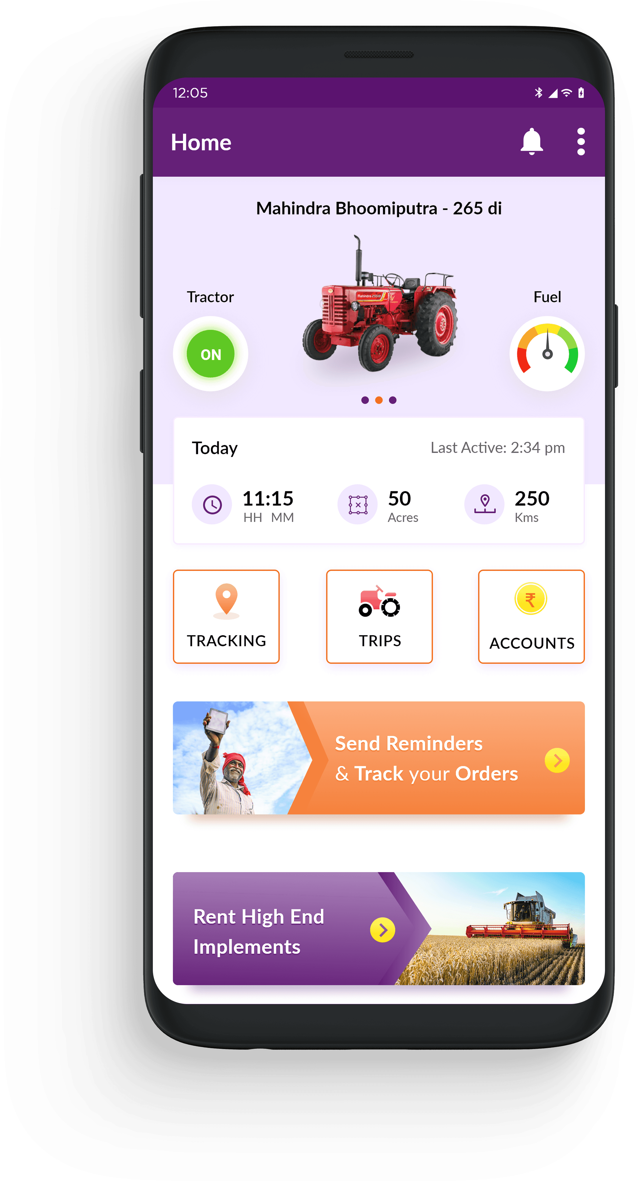


Designing for rural mental models
Conventional mobile UX leans on progressive disclosure: hide complexity, reveal it as users explore. Our research showed the opposite was true for rural operational users. They didn't explore. They acted.
Upfront information
More operational metrics surfaced directly on the home screen, rather than tucked behind taps.
Contextual navigation
Critical workflows stayed immediately accessible, not nested inside menus.
Visual familiarity
Interfaces used language, iconography, and terminology users already recognized from offline life, not generic app patterns.

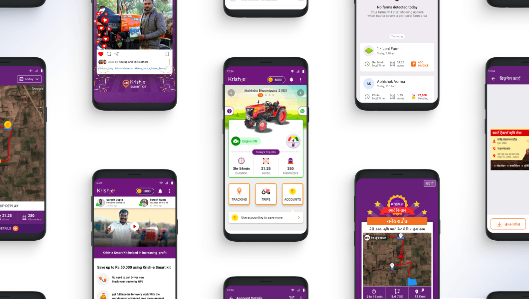
Digital khata
A unified accounting feature for payments tracked per farmer. Pending collections, operational invoicing, work-to-payment tracking, and contextual farm records.
Fintech
Designed a credit system that leveraged fleet owners' work records to unlock loan eligibility, improving access to formal financial services.
Social status
Enabled fleet owners to share their work on WhatsApp status, positioning them as progressive, tech-savvy fleet owners.


Testimonials

Retrospective
Minimalism is contextual.
Reducing visible information reduced confidence, not complexity. For these users, less wasn't simpler. It was less trustworthy.
Trust is a product feature.
Operational users needed transparency and explainability as much as they needed accuracy. A tracker that couldn't explain itself wasn't trusted, regardless of how precise it was.
Designing for emerging markets means designing for existing behavior.
Many conventional UX assumptions failed in low-literacy, operationally complex environments. The features that worked best didn't introduce new behavior. They digitized behavior users already trusted offline.
Other Projects

Fleet Monitoring System
We designed a platform that consolidated competitor tracking, market share trends, and sales performance into one workspace, giving teams a clear read on where they were winning, where they were losing ground, and why.
Password Protected



Video Telematics System
Designed an intelligent video telematics experience that leverages in-cabin and on-road smart dashcams to identify unsafe driving events, deliver timely interventions, and help fleets build safer driving habits.