Transforming a Legacy Enterprise Platform
Boosted user efficiency by 38% by modernizing a 10-year-old flagship product.
My Role
Lead UI/UX Designer (Strategy, Research Setup, Design System, Execution)

Problem Statement
The platform was riddled with dead ends, accessibility violations, unoptimized flows and disparity between Mobile and Web version.
This friction was causing two major issues:
Poor user retention due to lack of new features.
Custom features resulting in to multiple versions creating challenges for scale and maintenance.
Inability to expand into global markets effectively.

Discovery & Research
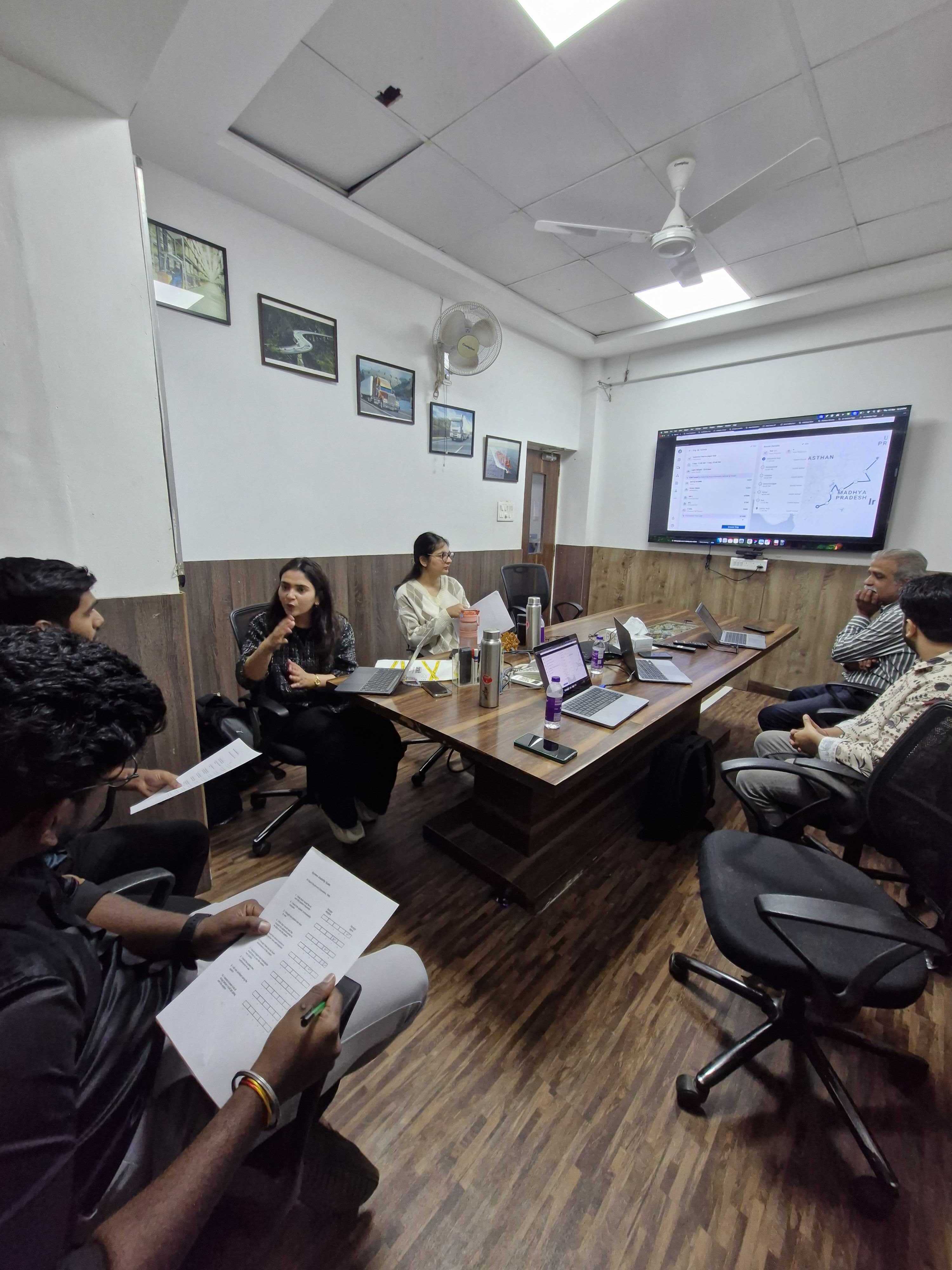
I was brought in specifically to lead this revamp. Since the product was critical for daily business decisions, we couldn't just "guess."
Internal Audit: We started by conducting a comprehensive UX audit to identify gaps.
Methods
10 Usability Heuristics - Jakob Nielsen.
Impact–effort matrix - Prioritization of immediate friction points.
Connecting with internal teams that have customer touch points - Service design.
Establishing a Research Culture: There was no existing framework for user feedback, so we established the customer research team. We initiated external discovery sessions to validate designs directly with end-users.
Methods
SUS (System Usability Scale) - Measure product’s perceived ease of use.
KLM (Keystroke-Level Model) - Existing workflow time.
1on1 user sessions - Generative Research.
Cohort Mapping - Archetype.
Global Context: We also managed the research requirements for the product’s global expansion, ensuring the new design would scale across different user behaviors and markets.

Definition & Strategy
Because the product was live and used daily for high-stakes decision-making, a "big bang" redesign was too risky. We devised a Phased Rollout Strategy:
Phase 1 (v1.5 - The Triage): We focused on "stopping the bleeding." We fixed critical accessibility issues, removed dead ends, and optimized the most painful flows. KLM for analyzing success
Phase 2 (v2.0 - The Overhaul): A full-fledged UI/UX update.
Key Initiatives:
Prioritization Framework: I implemented a weighted scoring system to prioritize features and pages, moving away from subjective decisions to a data-backed roadmap.
Got in touch with developers in order to understand tech deficit and where they lack what type of features
RICE Scoring
Feasibility check

Design System: To ensure consistency and speed up future development, we built a comprehensive Design System from scratch during the audit phase.
Modular designs, Variables to leverage country differences, Mix panel events and versioning.
The Solution
The redesign wasn't just about a visual facelift; it was about shifting the mental model of the product from a collection of isolated features to an interconnected ecosystem.
A. Solving the "Dead End" Problem (Contextual Navigation)
Before: The legacy platform treated every page as a silo. If a user spotted an anomaly in a report, the flow would end there. To investigate further, they had to manually memorize the data, leave the page, navigate to a different section, and apply filters again.
After: We introduced contextual drill-downs. Now, data points are interactive entry points. If a user sees an alert, they can click through to deep-dive immediately without losing context. We bridged the gaps between modules, ensuring there were no "dead ends," only continuous workflows
Global Filters
Enabling CRUD & User management
B. Reducing Cognitive Load via Feature Weightage
The Challenge: Over 8 years, the product suffered from serious feature bloat. Custom features built for specific legacy clients were visible to everyone, cluttering the interface with irrelevant tools.
The Fix: We conducted a Feature Weightage Exercise. By assigning value scores to every feature based on usage data and business value, we ruthlessly deprioritized or hid irrelevant features. This drastically reduced cognitive load.
C. The Ecosystem Strategy (Retention)
Based on competitor analysis, we realized users were leaving the app because external tools offered better "next steps."
We countered this by building a self-sustaining ecosystem. We integrated related actions directly into the platform (e.g., actionable insights, direct communication tools), creating a "stickier" environment where users can detect, analyze, and resolve issues without ever leaving the tab.
The Outcome
The revamp successfully modernized the platform while retaining the existing user base and helping in expansion of the user base.
Efficiency Spike: Post-launch analytics showed a 38% improvement in efficiency, meaning users could complete their core workflows significantly faster.
Retrospective
Data First: In hindsight, we should have prioritized cleaning the underlying data structure before jumping into feature design. Bad data often constrained our UI choices.
Process before Pixels: Setting up the research team and managing stakeholder expectations earlier in the process would have smoothed out the initial discovery phase.
Cost of api data from google